Bold Identity / Inclusive Design
The Bear Company
A bold, inclusive identity built around strength, individuality and Pride.
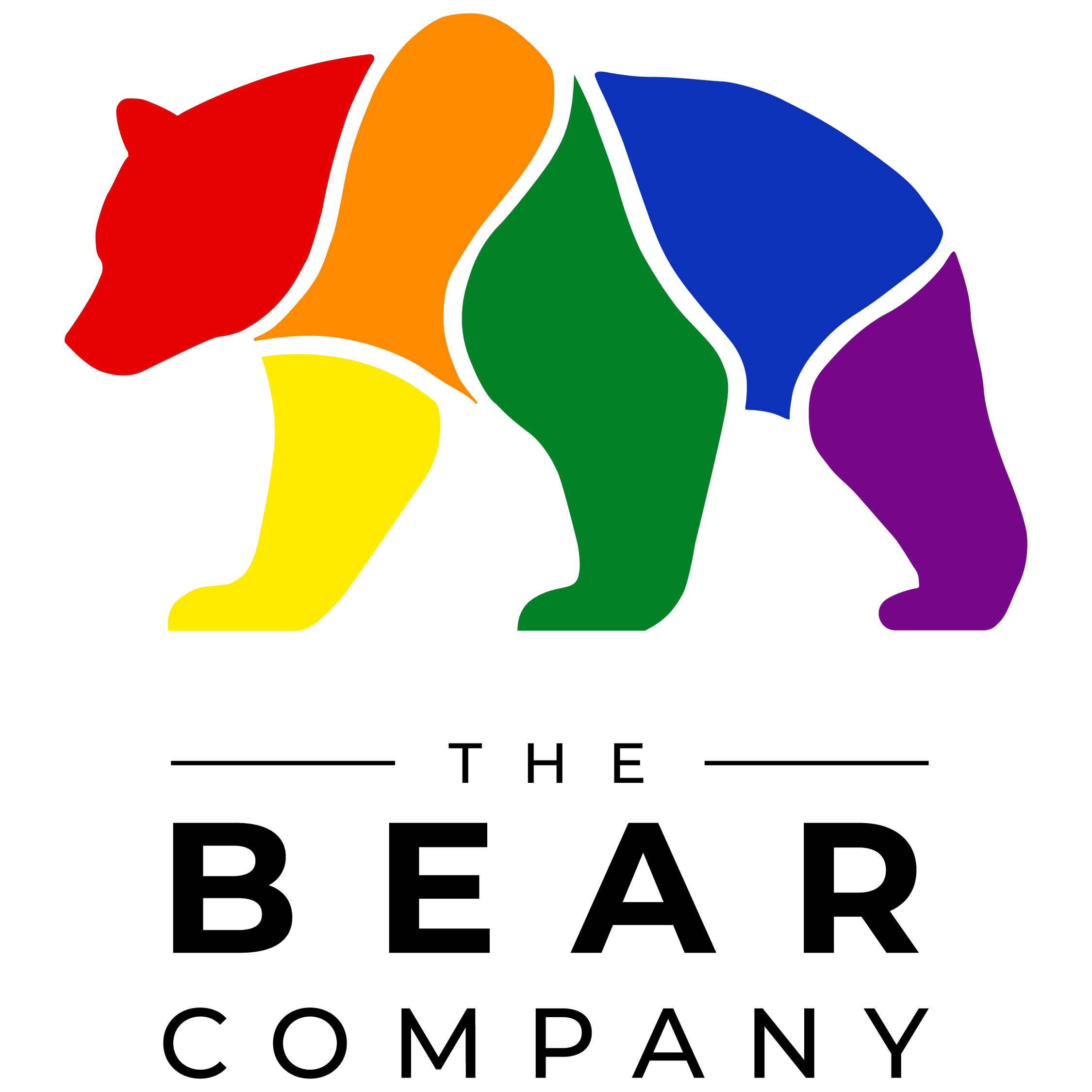
A distinctive brand identity built around strength, individuality and inclusivity - bringing Pride into the heart of the brand rather than simply applying it as decoration.
Project Scope
Logo design · Brand identity
The Brief
The Bear Company is a clothing brand built on Pride, confidence and community.
The goal was to create an identity that could stand shoulder to shoulder with established apparel brands - premium, simple and instantly recognisable.
Pride colours needed to be more than decoration; they had to be integral to the identity.
Strength. Individuality. Pride.
Three distinct directions explored how the strength of the bear could combine with the energy and inclusivity of Pride. Different in character, but each built around the same ambition: a bold identity with the confidence to stand on its own.
Concept 01
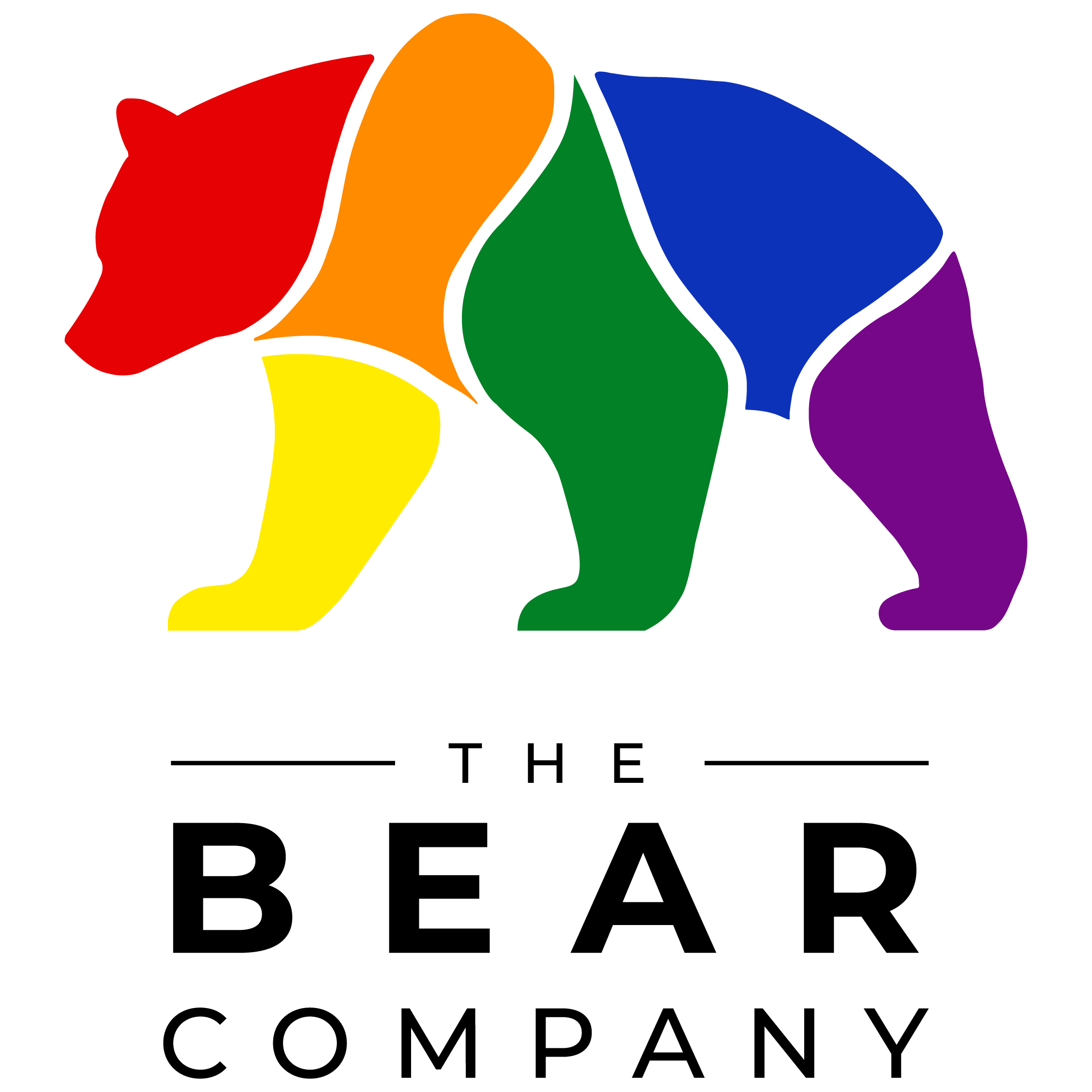
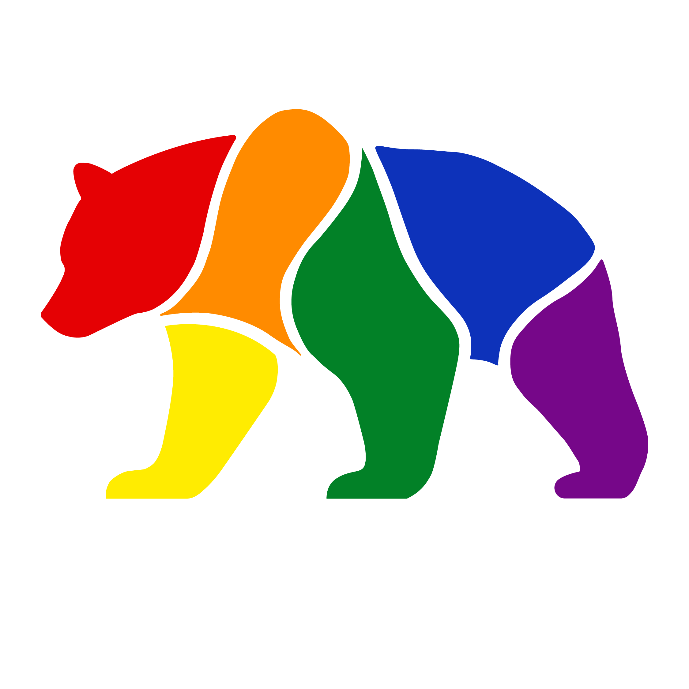
The Modular Bear
Six individual forms come together to create one strong, unified silhouette.
Concept 02
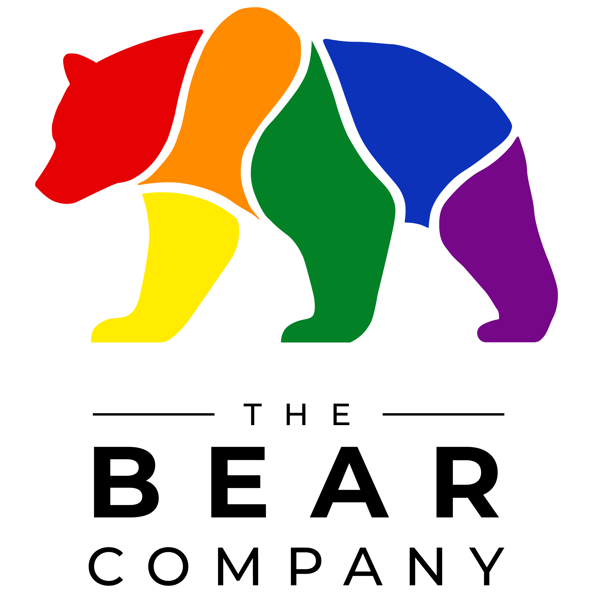
Icon + Wordmark
A clean combination of icon and wordmark, balancing Pride colour with a minimal, premium structure.
Concept 03
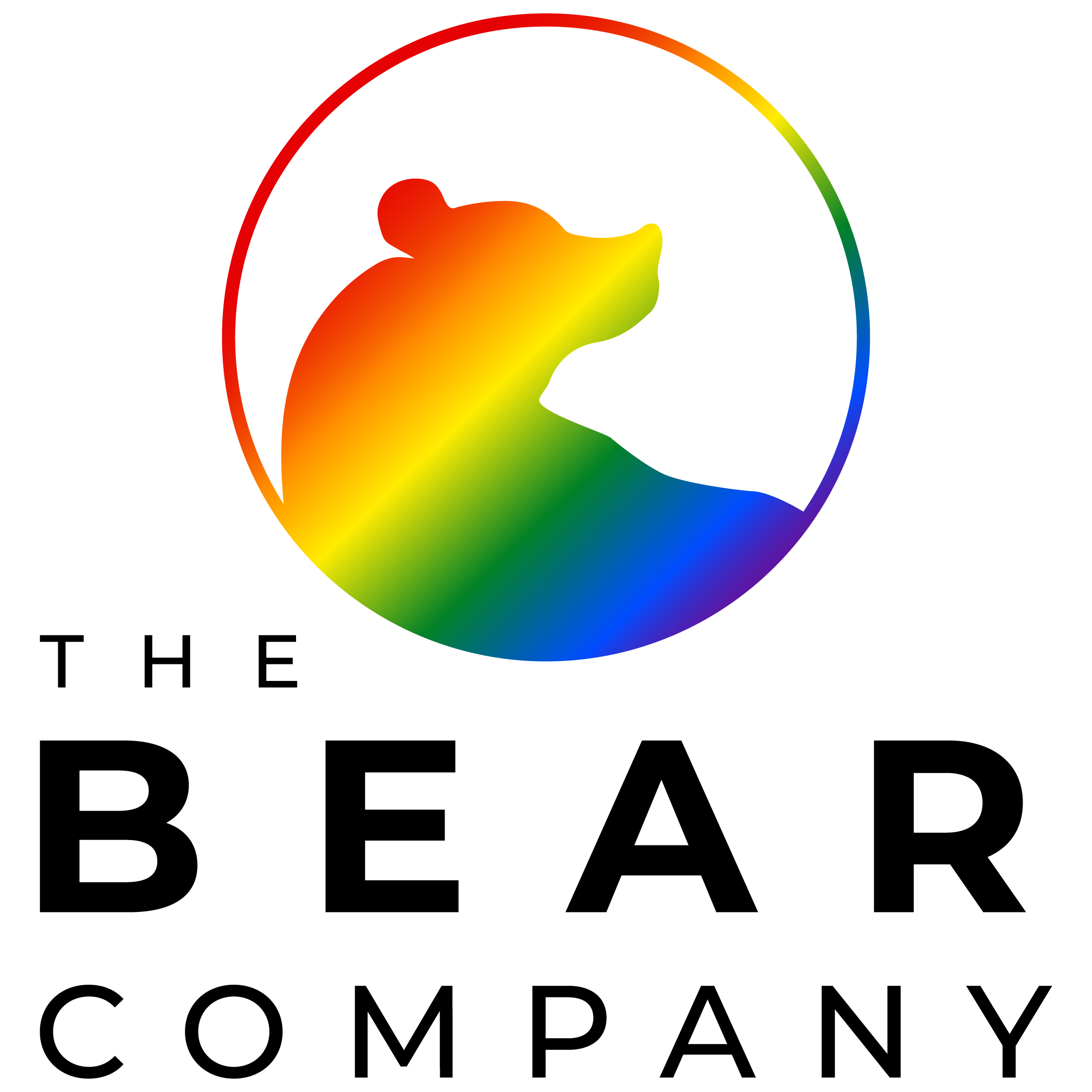
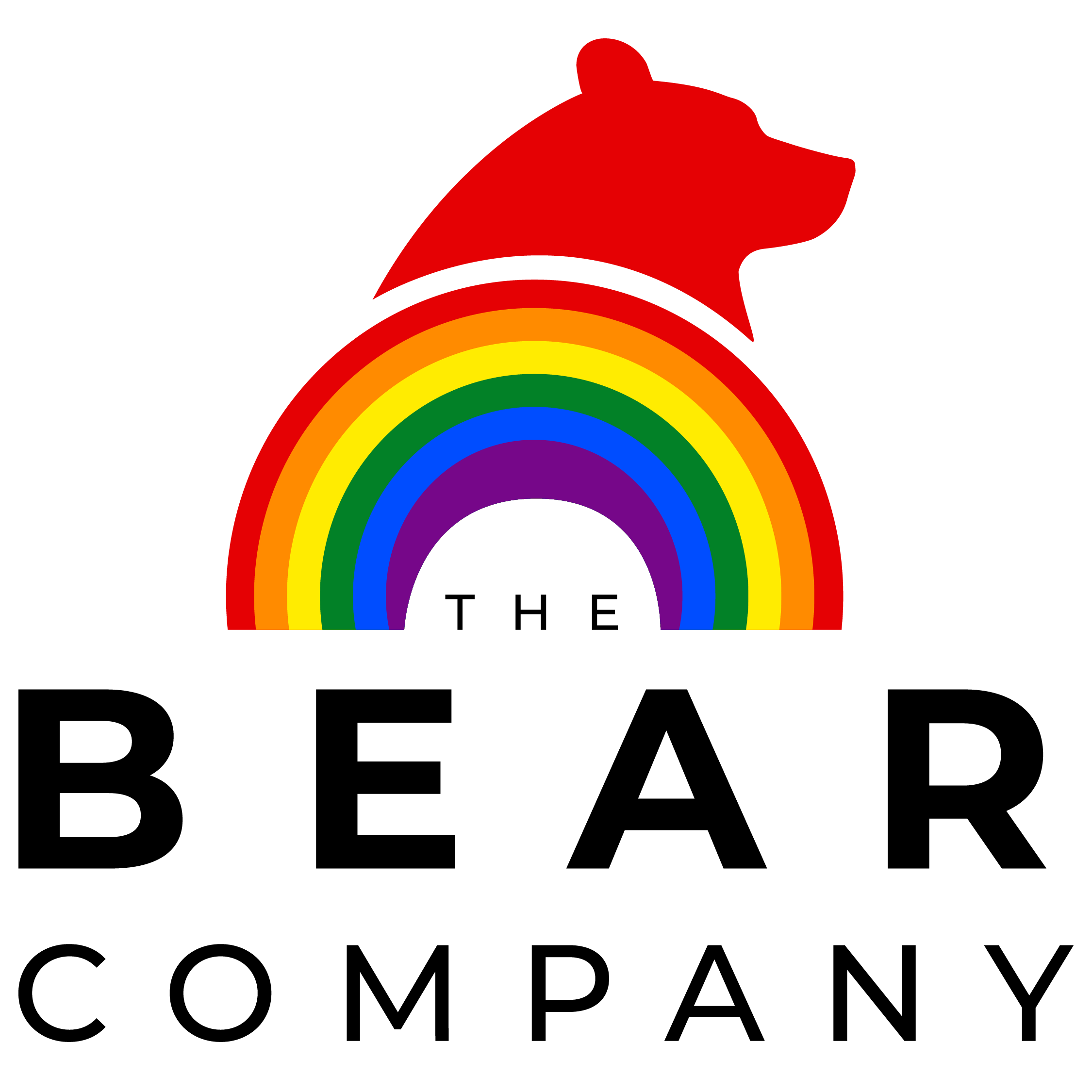
Arc Bear
A strong, instantly recognisable mark where the rainbow arc forms the foundation of the identity.
The Chosen Direction
A Distinctive
Silhouette
The modular bear stood out for its strength, simplicity and the way the Pride colours come together as one.
A confident, contemporary identity with meaning at its core.
Development
With the modular bear selected, the identity was pushed further through proportion, movement and line. Each route explored a different expression of the same idea while keeping the Pride palette at the heart of the brand.
Development 01
Refined Modular Bear
A refined version of the selected direction, strengthening the silhouette while preserving its distinctive segmented construction.
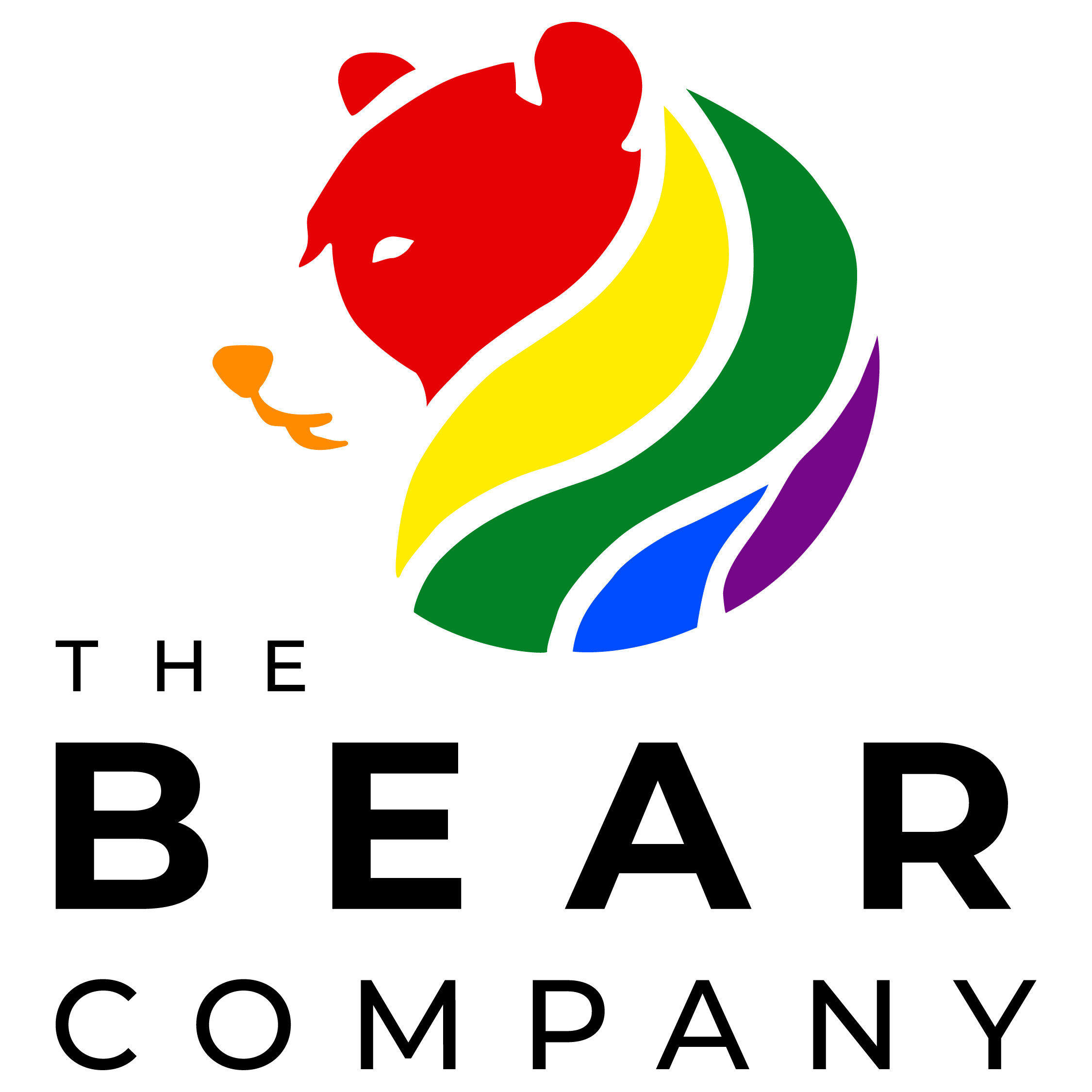
Development 02
Flowing Icon
A softer, more expressive interpretation using sweeping colour forms to introduce movement and personality.
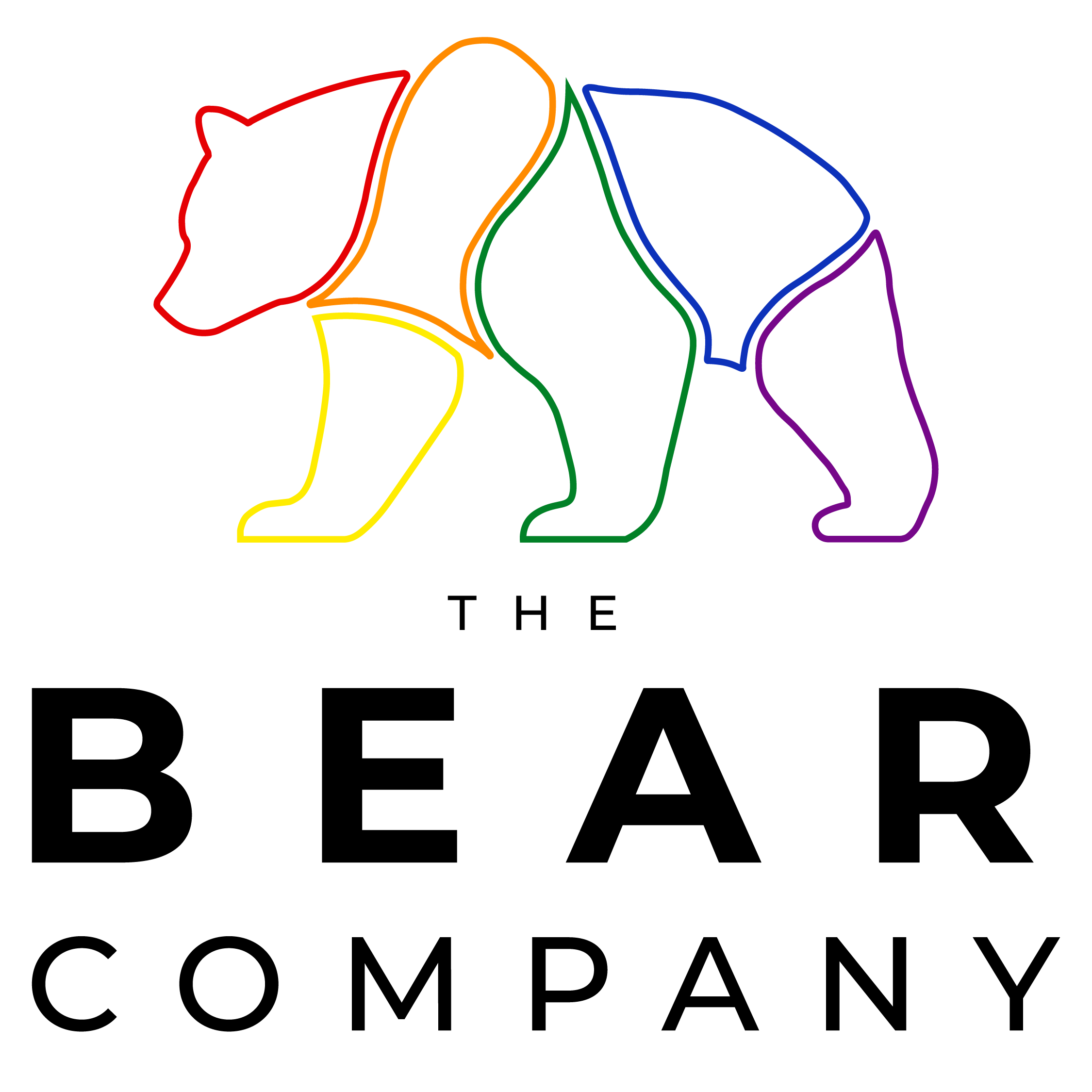
Development 03
Linear Bear
A stripped-back linear treatment testing how far the identity could be simplified while retaining the original silhouette.
The Bear Construction
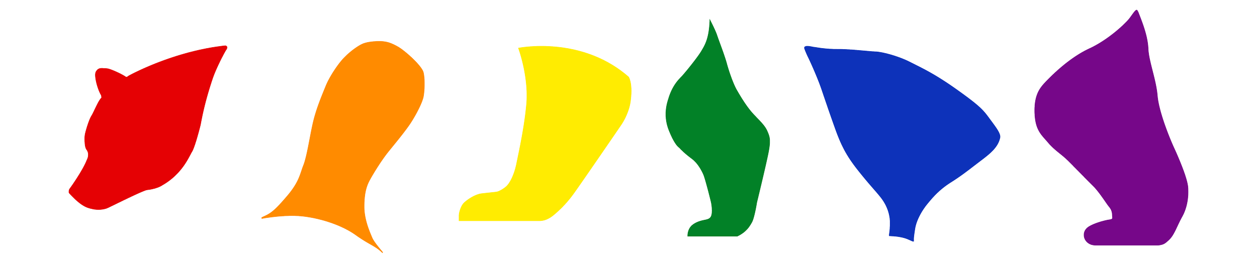
Each shape represents individuality. Together they create strength, unity and a bold, unmistakable identity.
Final Identity
& Applications
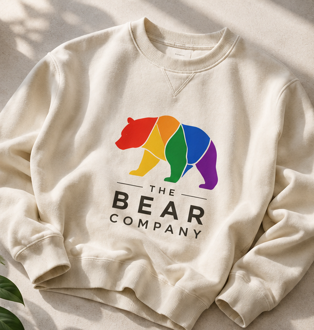
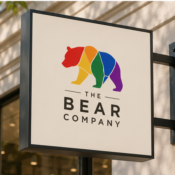
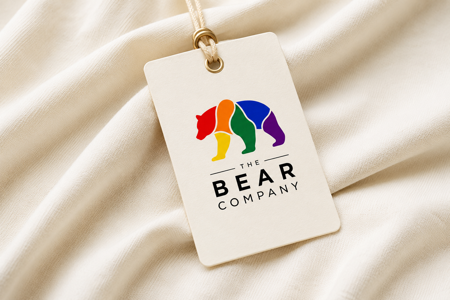
A confident, versatile identity designed to work across apparel, packaging, retail and digital — from embroidery and print to large-scale signage.